Hi there! I’m Cadu Carvalho (he/him), a 🇧🇷 Brazilian UI/UX designer and front-end developer based in 🇨🇦 Toronto. I’ve been working for the past 12 years building prototypes, sites and web applications for real-world users.
Also, I’m a typeface designer, typography nerd and writer of Tipo Aquilo, a Portuguese-language fortnightly newsletter about fonts in history and society. (=
-
-
- Web
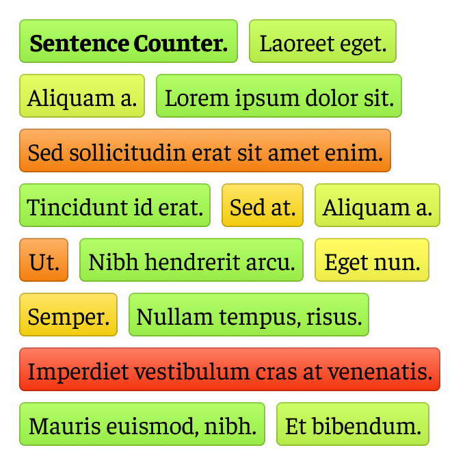
- Sentence Counter
- Sentence Counter is a small application to count the length of words or characters in sentences along the text, so you can visualize and fix missized sentences on the go.
-
-
-
- UX
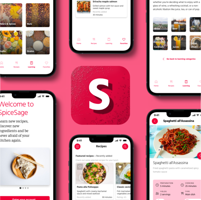
- SpiceSage
- Cooking is more than a chore; it's a way to connect, de-stress, and experiment new flavours. A product like SpiceSage, born from research and iterations, empowers beginners and intermediates. It offers recipes, food education, and an interactive cookbook to rekindle the joy of cooking.
-
-
-
- Web
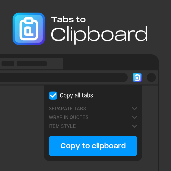
- Tabs to Clipboard
- Tabs to Clipboard is a handy tool that saves you time and effort by copying the URLs of all open tabs with just a couple of clicks. It supports Markdown lists, HTML syntax, multiple quotation marks wrapping, and tab selection. Say goodbye to tedious copy-pasting!
-
-
-
- Web
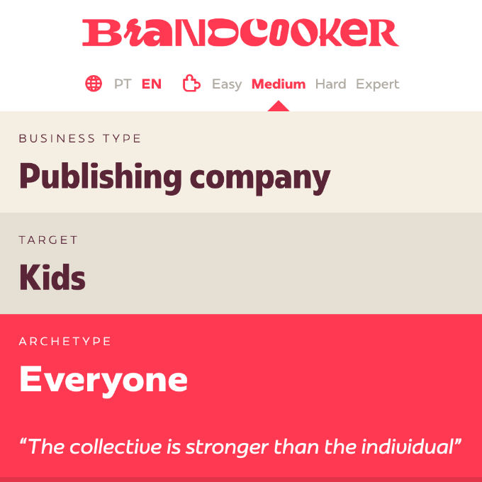
- Plau Brandcooker
- Brandcooker is a lightweight web application designed to optimize the exercise of designing logos based on specific requirements. It generates random branding briefings with four difficulty levels, allowing students to create and share new briefings.
-
-
-
- Web
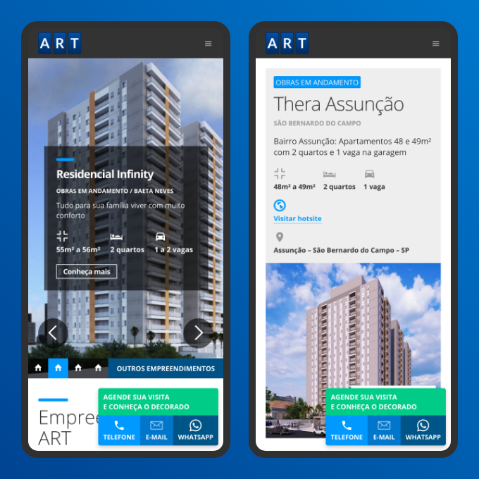
- ART Construtora
- ART Construtora, a construction company in São Bernardo do Campo, has been building properties for 40 years. The company's website acts as a contact point to communicate with customers, showcase units, and sustain its reputation.
-
-
-
- UX
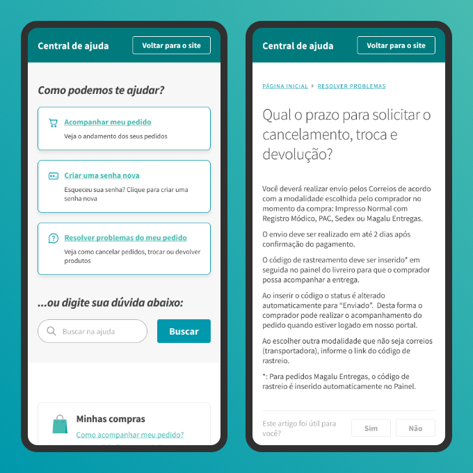
- Support site for Estante Virtual
- Estante Virtual is Brazil's largest online marketplace for new and used books, offering over 16 million units. While successful, it struggles with delivery complaints. A redesign proposal for the support page makes existing content more accessible.
-
-
-
- Web
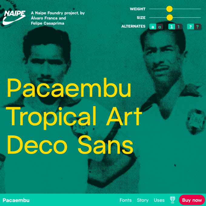
- Pacaembu font family landing page
- Naipe Type Foundry created a variable font family named Pacaembú, inspired by Brazil's oldest stadium. The Pacaembú website offers an interactive experience to experiment with the font, interact with components and even play with historic soccer line-ups, honouring the stadium and Brazilian soccer history.
-
-
-
- Web
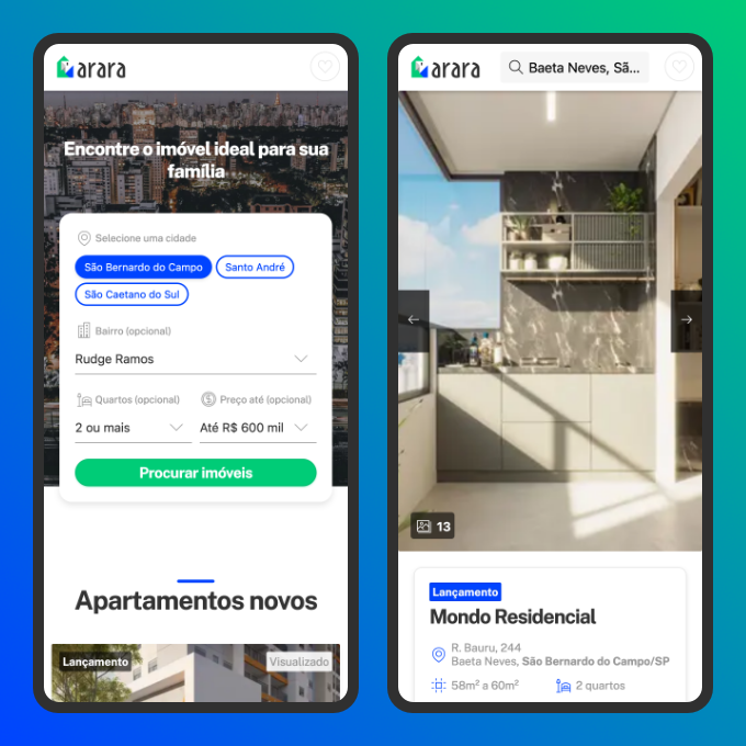
- Arara website
- Arara is a Brazilian platform that connects potential buyers with real estate agents for new and under-construction apartments, improving their the discoverability. The design process involved deep competitor analysis and adaptation of their features to Arara's target.
-
-
-
- Typography
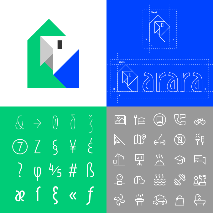
- Arara logo and typeface
- Arara is a search & acquisition platform for under-construction apartments. The brand targets people seeking affordable homes and values simplicity, trust, transparency, and digital. Arara also has a custom font family with five weights and more than 1,900 characters.
-
-
-
- Visual identity
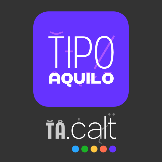
- Tipo Aquilo logo
- Tipo Aquilo is a Portuguese biweekly newsletter focused on typography and design, contextualizing the state-of-the-art with history. In 2022, the newsletter moved to Substack with a new logo and visual identity with various applications on Substack and Instagram.
-
-
-
- Lettering
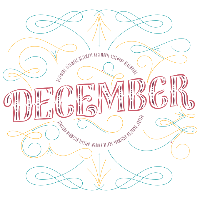
- December (Lygia Pires’ calendar)
- Yearly, the calligrapher and visual artist Lygia Pires creates a calendar with her students, featuring a different piece of art for each month. In 2020, she closed the calendar with a flourished Tuscan-inspired lettering for December, with inline decorations, swashed terminals, and Art-Déco-inspired flourishes.
-
-
-
- Typography
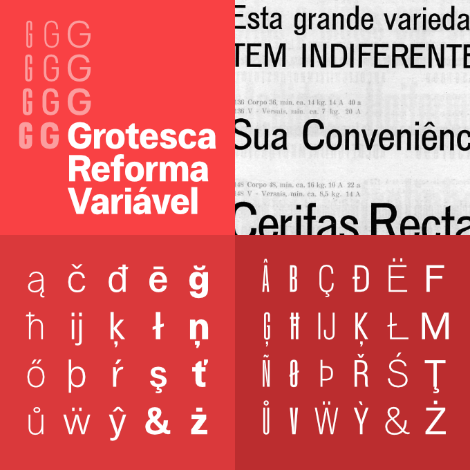
- Grotesca Reforma Variável / Eisenbahn Grotesk
- Grotesca Reforma is a variable font family created from old prints of Funtimod's type catalogues. The project pays tribute to the Brazilian type foundries of the early 20th century and the grotesque style in typography.
-
-
-
- Typography
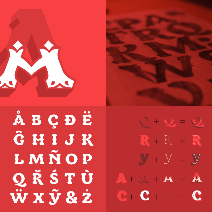
- Junina font family
- Junina pays tribute to Festas Juninas in Brazil, the traditional midsummer celebrations. Also, it addresses the local sign painting, a vernacular art form practiced by those without formal training. The font family offers seven stackable fonts with colourful and ornamented letters.
-
-
-
- Lettering
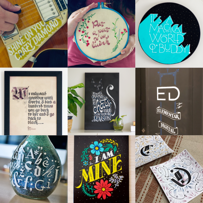
- Assorted letterings
- Calligraphy and lettering lay the foundation for designing typefaces and creating balanced lettering works. This collection of hand-drawn lettering reflects the author's passion for exploring different styles and techniques.
-