Estante Virtual, part of the retail company Magalu, is the largest Brazilian online marketplace for new and second-hand books, offering circa 16 million units from hundreds of book thrift stores. Since 2005, Estante Virtual has sold more than 23 million books for amateur rarity collectors, passionate readers and, more often, people who can’t afford brand-new books. Despite its commercial success, Estante Virtual struggles with many complaints in review platforms regarding problems along the delivery process, such as clients receiving wrong books, out-of-stock books yet for sale, and unrecognized payments.
Although common for every marketplace, the high recurrence of reviews regarding these problems pinpointed a hypothesis of a lack of official content for customers facing such misfortunes. However, a proper investigation revealed that even though this content already existed, it was easier to find this information on a Google search than on its support page. To make this content more reachable at first glance, match the support page’s visual identity with the marketplace platform’s and accomplish the level 0 project of Aela MID Bootcamp, a complete redesign of Estante Virtual’s support page was proposed.
The process of researching (in Portuguese) the Brazilian second-hand market, EV’s main competitors, the way of life and state of mind of its customers, and the purchase experience led to a better understanding of how the support page could aid customers. Information regarding easy-to-solve problems gained discoverable access points with high visibility on the first page. An interactive prototype made in Figma is the final deliverable of this project, which addresses the problems found along the research and offers a vision of how to improve the support page.
First findings
The first chapter of this process started with desk research to better understand the company and its business model, the competitors, the target audience and their characteristics. Some key findings answered questions about literacy in Brazil, the literature market, and book thrift consumers’ perception.
- Bookworms and bargain hunters: the thrift market in Brazil has been growing since the last decade as the country’s economic growth has diminished. Despite looking stylish in the fashion business, book thrifting is still something for people who can’t afford regular market prices or rarity collectors.
- The lone writer: Estante Virtual runs almost solo in the Brazilian online book thrifting market. Its’ main competitors are general thrifting platforms (Mercado Livre, Enjoei), book clubs and niche bookstores, which sell antique and rare editions and sometimes have an online marketplace.
- Shooting the messenger: most complaints about Estante Virtual in review platforms regard problems off the company’s control. Issues about delivery and return failures, wrong books received, orders with out-of-stock units, and unresolved refunds are common on such platforms.
Benchmarks
The second stage of this process compared Estante Virtual’s site and support section to other bookstores and general thrifting platforms. The comparison brought needed improvements for the support site regarding the content arrangement, the discoverability of problem-related articles and how to deal when the users can’t find an answer to their complaints.
User journey
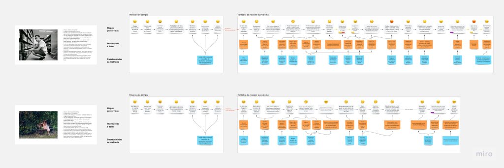
Who are the customers of Estante Virtual? How do they search and browse the site? How do they pay for their orders? What kind of failures happen in the purchase? How can they avoid or mitigate these problems? The third step enlightens the user experience journey of two customer groups: bargain hunters and bookworms.
Each group represents a persona which gathers the lifestyle, personality, life goals, pain points and frustrations. Later, these personas were submitted to some problems found in the desk research process to discover how they solve them on the site and how they proceed if they can’t resolve them.

Problem discovery and hypothesis
The benchmarking and the user journey’s pain points revealed critical problems in the purchase experience. The support section demanded more visibility and should improve the user’s confidence and awareness of problem-solving content, especially regarding issues the company can’t handle alone.
Although the help center should encourage the user to find their answers, it should also let the user contact the support team as soon as he needs it. Some hypotheses of how to solve these problems included adding shortcuts to critical articles, rearranging the content, adding a chatbot for non-business hours and increasing the visibility of links to contact forms.
Wireframing and prototyping
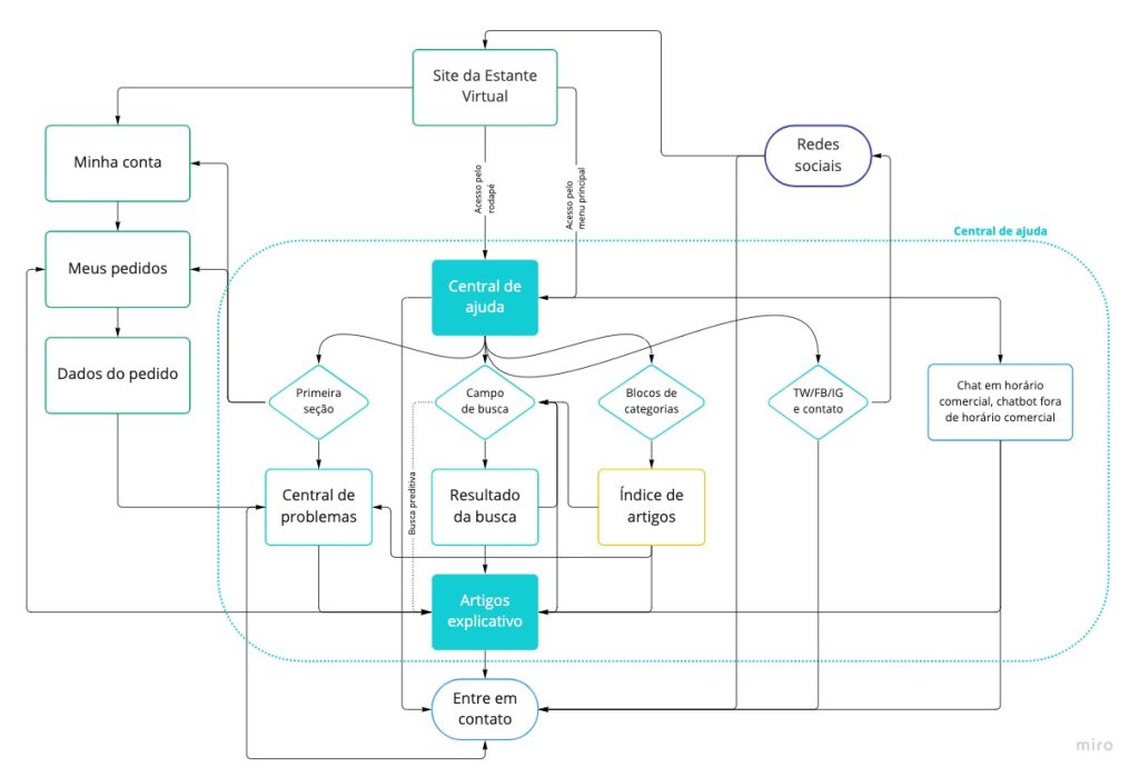
The last part of this project included some flowcharts to illustrate the information architecture and the path to current problem-solving content in the support site. These diagrams helped to create shortcuts for critical articles and rearrange the information architecture for a new help center.
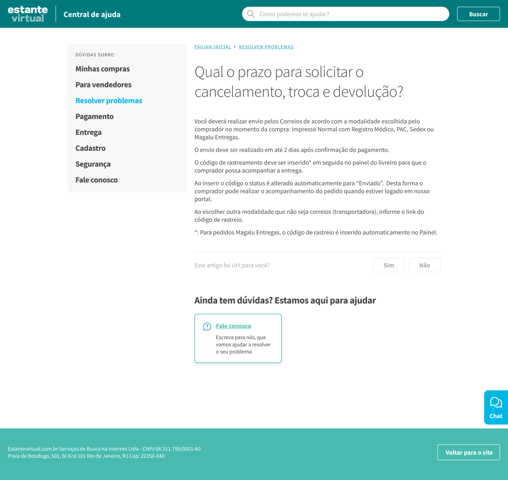
Later, hand-drawn sketches provided a foundation for the wireframes in Figma, which addressed content display, navigation and access points. Finally, a style guide drove the art direction for an interactive prototype which demonstrates how the design process aims to solve the discovered problems and preview the user experience on desktop and mobile devices.


