The Brazilian typography industry has been a matter of interest for researchers recently. It wasn’t until the 1900s that the largest foundries in the country were born, and none of them survived the migration to desktop publishing at the end of the last century. The largest Brazilian foundries, Manig and Funtimod, provided fonts to hundreds of graphic workshops for fifty years until they became obsolete.
After these companies closed their doors for good, the remnant fonts, specimen books and machinery became study objects for researchers. These studies long to answer unclarified questions regarding the origins of these fonts, their ancestors and licensing. One of the most popular font families from Funtimod’s catalogue was the Grotesca Reforma, a series of sans-serif fonts derived from old German foundries with several styles and weights.
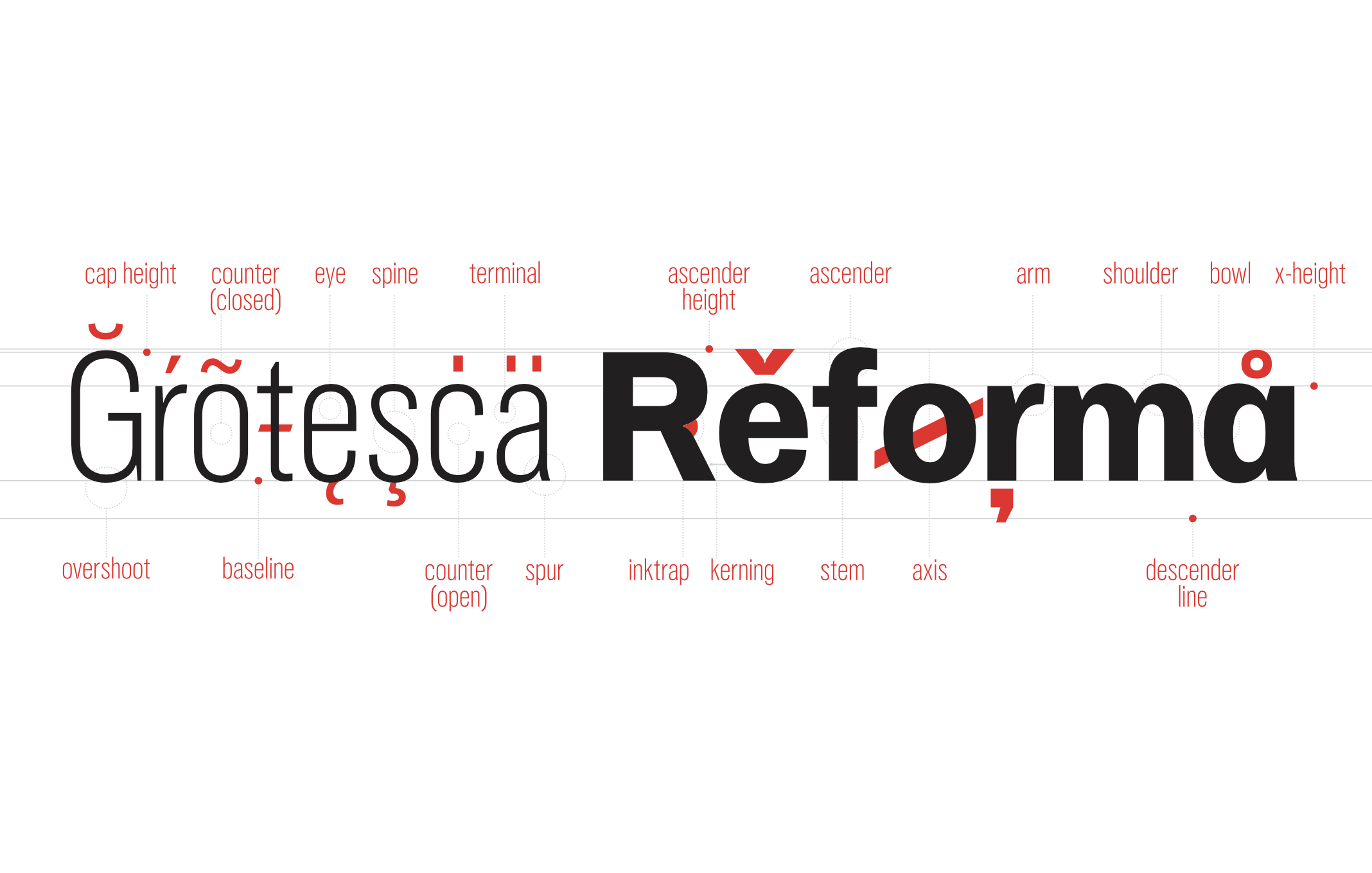
Grotesca Reforma is the typeface of the titles and excerpts you’re reading here. It’s a variable font family created from old prints and examples of Funtimod’s Grotesca Reforma and Stempel’s Reform Grotesk. The original letterforms provided a basis for the master fonts and their interpolations, generating a variable space defined by two axes, width (compressed to normal) and weight (light to black). This project, presented at international congresses such as DiaTipo and CIDI 2019, helped to clarify the proceedings and cautions regarding variable fonts from type revivals.
The Brazilian brewery Eisenbahn features on its website, social media posts and the book “Além da Mesa,” the typeface Eisenbahn Grotesk, an exclusive tailored version of Grotesca Reforma with revised spacing and expanded glyph set.


